DOROTHY KOPPELMAN: WATER TOWERS
Paintings Water Tower Pastels
On Water Towers & Why I Love Them
By Dorothy Koppelman
I learned in Aesthetic Realism classes with Eli Siegel what made my life coherent: I wanted the same thing as a person that I was after as an artist—to put opposites together.
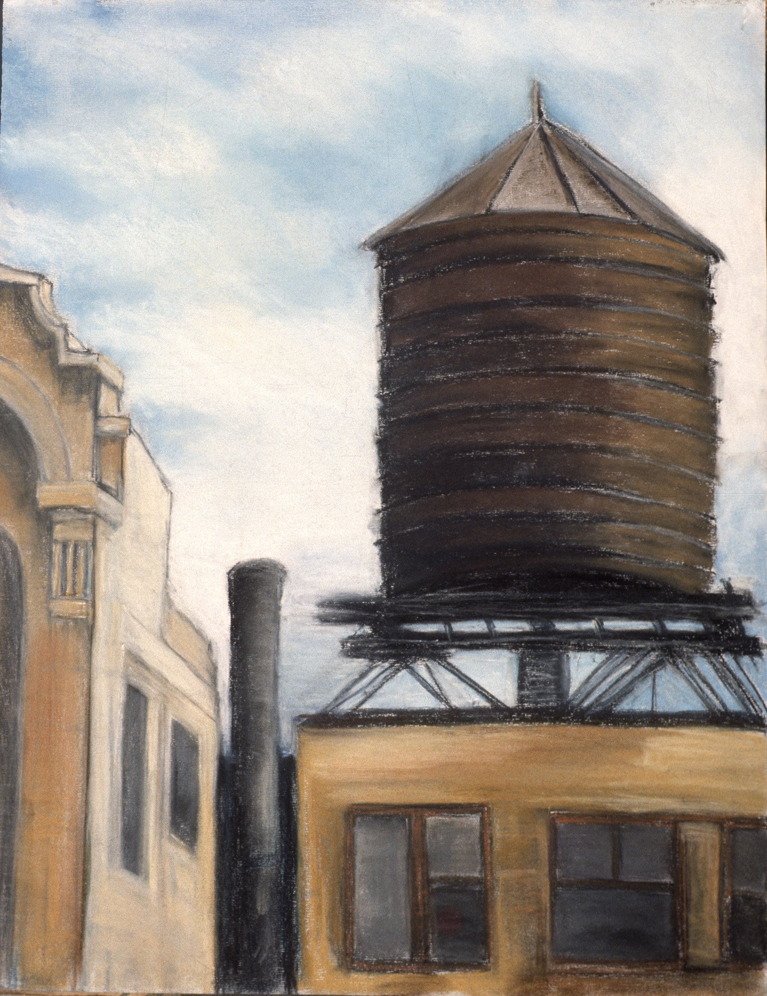
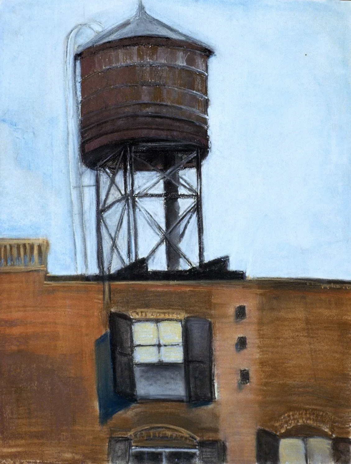
I have for more than a decade been captivated by the water towers of New York City, and I think the reason is two-fold. The water towers are simultaneously heavy and light, and I think that oneness of opposites is why so many New Yorkers are moved looking up at these high and weighty forms.
I love the large, round shape, the pointed roof or cap that rises on top, and the slim, strong legs that form the base. There is a literal and formal suspense—a dynamic feeling of opposites at work—in the way those criss-crossing supports lift that form. We see, simultaneously, the rooftop outline of a massive building, light sky showing through the thin iron legs, and the humble yet confident rising of those weighty, wooden cylinders.
As I have taken many photographs, and done a series of pastels, I hope to be true to those structures and their meaning. The way those wooden towers are both dignified and somehow modest, high and low, is just the way I want to be—proud but not arrogant, humble but not lowly, earthy and effortlessly light. Eli Siegel taught that art solves in outline the questions of our lives, and every time I look up at one of those grand structures, rising with such ease, I see the truth of that great principle—I feel my self is more composed and I am grateful.

PROUD AND HUMBLE, c. 1984, pastel on paper, 40 x 28 in
Click on first image to see a slideshow of the works below, or on any image to enlarge.